

Checklist for a strategic website

Context
September has always been synonymous with restarting. After the summer break, we are back to planning, building strategies, setting concrete goals for the last quarter of the year. And it is precisely in this context that your website deserves a close look.
From showcase site to strategic site
The company website is not just a showcase: it is a living, identity-based space, the exact point where a person can get in touch with who you are, with what you do and with the way you do it. It’s often the first (and sometimes the only) place where a potential customer gets to know you, gets an idea of your value, and decides whether to dig deeper… or go elsewhere.
The truth is that many sites, with the passage of time, stop really representing the company that created them. They become heavy, populated with useless sections, lose coherence, or simply lag behind how your identity has evolved.
That’s why September is the perfect time to stop and ask yourself a key question: “What do I want my site to communicate – and what do I want it to do – from here on out?”
To help you, we’ve built a strategic, concrete checklist, which you can use to analyze the current state of your site and figure out where to take action.
It’s not just about aesthetics or functionality, it’s about consistency, effectiveness and impact.
1. Does the site still reflect who you are?
Has your business changed? Have you entered new services, changed your tone of voice, changed your target audience or started a new placement?
If the answer is yes (and it often is), the site must necessarily reflect this evolution. A site disconnected from your current reality creates friction: it does not communicate clearly, it does not represent you, it does not help the public to perceive the real value of your work.
Starting again also means realigning form and substance.
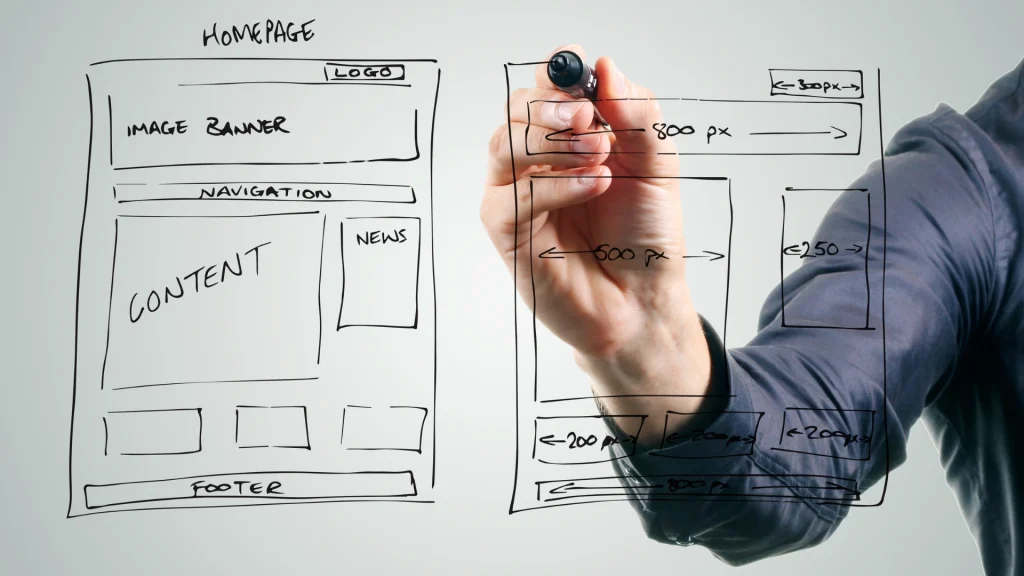
2. Does the homepage immediately communicate what matters?
The homepage is the main door to your website: the most visited page, the one that often determines whether a user stays to investigate or leaves after a few seconds.
It’s not just a business card, but the place where the first digital impression of your company is played. A visitor who lands on your site must be able to immediately understand:
- who you are (your identity and positioning);
- what you offer (products, services or concrete solutions);
- who you are addressing (target audience, sector, needs you intercept);
- what he can do immediately (the next step you propose to him: contact, request a quote, sign up, buy).
If these elements do not emerge in a clear and orderly way, the risk is that the homepage becomes just an aesthetic container, unable to really communicate value.
A confused, generic or excessively “decorative” homepage generates bewilderment, slows down navigation and above all causes the loss of commercial opportunities.
An effective homepage must therefore guide the user in a natural way: with a direct and readable title, a subtitle that immediately clarifies your proposal, an uncluttered visual structure, images consistent with the brand and well-placed call to action buttons.
Remember: you don’t have to impress at all costs with special effects or complex graphics. The real strength of a homepage lies in its clarity and ability to convey your brand promise in seconds. A simple, well-organized, and action-oriented page is much more persuasive than a spectacular but unintuitive site.
3. Is the site optimized for smartphones?
In 2025, more than 80% of web traffic comes from mobile devices. This means that the site must be designed for mobile first, not adapted later.
It is essential that the menu structure is readable, that the texts do not force continuous zooming, that the buttons are easily clickable even from a small screen, and that the site loads quickly, even on the move.
A well-designed mobile experience improves not only usability, but also the professional perception of your company.
4. Is the content up-to-date and representative?
A website lives and grows with your business. If content is not reviewed periodically, it risks becoming a dusty showcase, which conveys more disinterest than professionalism.
A page with services that are no longer active, a portfolio that has been stagnant for years or outdated articles not only appear irrelevant, but can make the visitor think that the company is no longer dynamic or up-to-date.
Updating content does not simply mean “correcting errors”: it means telling who you are today, enhancing your most recent activities and maintaining communication consistent with your identity.
When checking content, ask yourself these questions:
- Does online information really reflect your company’s current services and expertise?
- Are the images professional, quality and in line with the tone and values of the brand?
- Do the texts speak clearly to your audience, or are they too self-referential and distant from their needs?
- Do calls to action lead the user to actions that are really useful to your business?
Up-to-date content has a double impact: it improves the perception of the brand in the eyes of users and at the same time strengthens SEO visibility, because search engines favor sites that demonstrate freshness and relevance.
In summary, a site with up-to-date content not only informs, but conveys energy, reliability and credibility. It is concrete proof that your company has not stopped, but continues to grow and offer value.
5. Is the site visible on search engines?
A site that no one finds isn’t working for you.
For this reason, SEO cannot be considered a “technical” detail, but a strategic lever. An effective site must have:
- clear and consistent titles and meta descriptions;
- relevant keywords, naturally integrated into texts;
- a light, fast structure, easily readable by both users and Google;
- Original and relevant content for those looking for your services.
If your site doesn’t appear in the top results for the keywords that matter… It is time to intervene.
6. Does it guide the user to an action?
Each page should have a specific purpose and offer a clear next step: contact you, download a document, book a consultation, view a service.
A well-designed call to action is not intrusive: it is useful, natural, and accompanies the user in his exploration.
A site without a CTA is like a store without clerks: nice to look at, but hard to live with.
7. Is it compliant with privacy and cookie regulations?
It’s the most boring aspect for many… but also among the most important.
Being GDPR compliant, showing a configurable cookie banner, offering easy access to privacy policies and terms of use is not only correct: it is mandatory.
In addition, forms must be tracked, secured, and built in compliance with regulations.
Trust is also built in legal details, and your users (and Google) notice it.
Conclusions
An up-to-date, functional, consistent and well-positioned site is not only “more beautiful”:
- is more effective in communicating,
- more professional in the eyes of those who arrive,
- to support the growth of your business.
September is the perfect time to stop, observe, analyze, and decide where you want to go — and how your site can help you do so.
Do you want an analysis of your site or support to redesign it?
We at Jinni can help you starting from a strategic and tailor-made check-up, analyzing structure, content, performance and user experience, to build (or renew) a digital space that truly reflects who you are.