

Website: what cannot be missing on the homepage today
Context
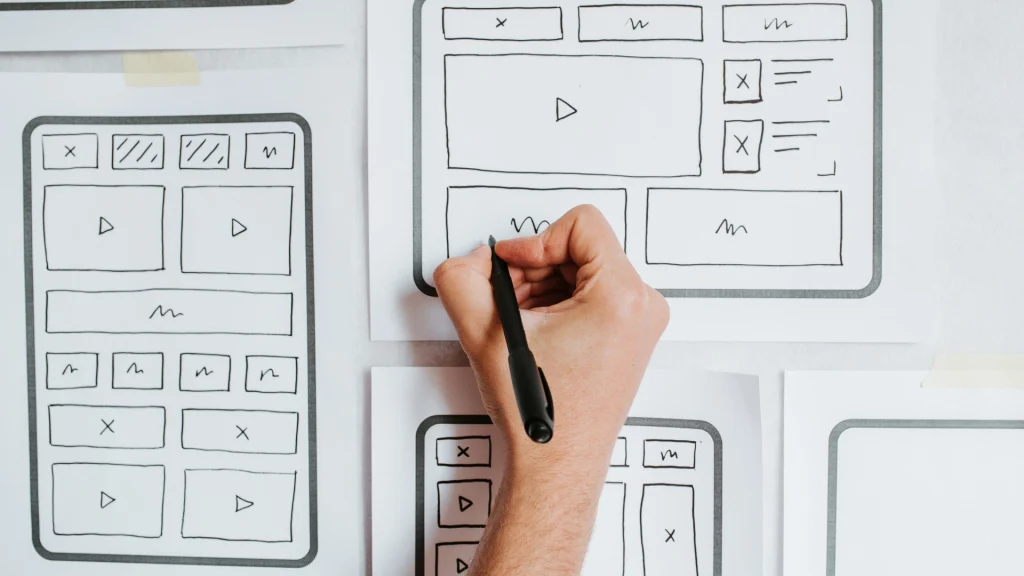
In 2025, the company website is much more than just a presentation: it is often the first point of contact between you and a potential customer. And the homepage is the first impression, the one that can attract, intrigue… or make them escape. A site can be beautiful, fast, modern. But if the homepage doesn’t answer the user’s questions right away, it doesn’t work. Who are you? What are you doing? Why should I trust you? An effective homepage must be able to tell, orient and convert. In this article, we explain the essentials for an effective homepage today.
The elements that cannot be missing on the homepage
Building an effective homepage isn’t just about choosing a beautiful layout or inserting eye-catching images. It means designing each section with a specific purpose: to inform, guide, convert. In an increasingly competitive digital environment, each element must work together to deliver a seamless and engaging experience. Below are the essentials that a modern, strategic homepage can’t afford to ignore — if you really want to capture attention, build trust, and turn visitors into real leads.
Security is an integral part of digitalization
Those who rely on us for digitization projects also receive operational security advice: we never propose solutions without first evaluating how to protect data, who should access what, and which tools to use consciously.
The goal is not just to “make backups”, but to create a culture of protection.
1. A clear and concise message
No vague phrases or generic slogans. The visitor must understand in a few seconds who you are, what you do and who you are addressing.
Use a headline and subheadline geared toward customer benefit.
2. A visible and consistent CTA
A homepage with no call to action is a dead end. What do you want the visitor to do? Contact? Discover your services? Book a consultation?
Place a prominent primary CTA above the fold (e.g., “Request a free consultation”) and other secondary CTAs at strategic points.
3. Visual content that reinforces the message
Short videos, real images, light animations: everything can help, but only if it serves to drive attention and enhance the content.
Avoid the classic generic stock, opt for authentic content that is consistent with the visual identity of the brand.
4. Featured Services or Solutions
Don’t assume that the user is going to look for the “Services” page. A summary of your areas of expertise should already be present on the homepage, perhaps with a block layout or icons.
5. Confidence tests
Include elements that strengthen your authority:
- Customer Reviews
- Partner or customer logos served
- Certifications or awards
- Case Studies
- Measurable data (e.g. “+250 completed projects”)
6. Contacts or form visible
Don’t force users to search for how to contact you. A contact block, a floating button, a mini form on the homepage are elements that will reduce friction and increase conversions.
7. Speed and mobile-first
It’s not a technical detail: it’s a decisive SEO and UX criterion. 70–80% of traffic today comes from smartphones. A homepage that loads in 5 seconds or with illegible texts on mobile… it loses customers. At Jinni, we always work with a mobile-first, responsive and optimized approach, also from a Core Web Vitals perspective.
8. Privacy and transparency
Let’s not forget about the legal aspect:
- Banner cookie GDPR-compliant
- Prominent links to Privacy Policy, Terms and Conditions
- Security indicators (e.g. HTTPS, badges, etc.)
Today, trust is also built through clarity and compliance with regulations.
Conclusions
Think of the homepage as a digital assistant that welcomes each visitor: it listens to them, orients them, proposes the next step.
Do you want to understand if the homepage of your site really works?
Let’s talk about it together:
. We can check together and propose tailor-made improvements, without upsetting everything.