
Business Websites: 5 Signs Yours Needs To Be Redone
Context
The website is often the first point of contact between a business and its potential customers. It’s your digital storefront, the place where people get an idea of who you are, what you do, and most importantly, if they can trust you. Yet many companies continue to use sites that are old, poorly updated, or simply no longer in line with the expectations of modern users.
But how do you know when it’s time to do it from scratch? There are some pretty obvious signs that shouldn’t be ignored. Below we can see 5 of the most important
1. The design is dated
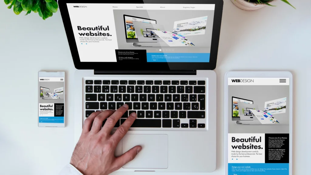
Design is a real communication tool. A visually outdated site subconsciously communicates that the company may be too. And this happens in a few moments, even before the user starts reading the content.
For example, very rigid layouts, little white space, excessive use of colors or “old-fashioned” graphic elements can make navigation tiring and unintuitive. Generic or low-quality images also contribute to an unprofessional impression.
A modern design, on the other hand, guides the user; Use clear visual hierarchies, highlight important information, and create a seamless experience. It is not a question of following trends, but of respecting the current expectations of users, who are used to simple, clean and quick to understand interfaces.
If your site can’t convey who you are and what value you offer right away, it’s probably time to rethink it completely.
2. It’s not really designed for mobile (it doesn’t just “fit”)
Many sites are referred to as “responsive,” but that doesn’t automatically mean they offer a good mobile experience. Adapting to the screen is only the first step: the real goal is to make navigation comfortable, fast and intuitive even from smartphones.
A poorly designed mobile site often has obvious problems: menus that are difficult to open, text that is too small, buttons that are too close together, or sections that require too much scrolling to get to the point.
In addition, on mobile the user has less time and less patience. He wants to find what he is looking for immediately: a contact, a service, an answer. If he has to “struggle” with the site to get it, he will most likely abandon it.
A remade site with a mobile-first approach starts right here: it simplifies content, makes paths clear and facilitates key actions, such as calling, writing or requesting information.

3. It’s slow and underperforming
Loading speed is one of the most underrated aspects, but also one of the most critical. Even a few seconds of waiting can make the difference between a user who stays and one who leaves.
Older sites often accumulate technical problems over time: unused plugins, unoptimized code, images that are too heavy or inadequate hosting systems. All factors that slow down the loading of pages.
But slowness is not just a technical problem: it is a problem of perception. A slow site is associated with poor efficiency and care. On the contrary, a fast site conveys professionalism and reliability.
In addition, speed also directly affects SEO. Search engines favor high-performing sites, so improving this also means increasing the chances of being found online.
4. Content is no longer aligned with your business or customers
Over time, every company evolves: services, positioning, and target audience change. But often the site remains stuck in a photograph of the past. It happens to find pages with services that are no longer offered, generic descriptions or texts written without a real strategy.
In other cases, the content is either too technical or, conversely, too vague and ineffective. An effective site must answer precise questions:
- What do you do?
- Who do you do it for?
- What problems do you solve?
- Why should they choose you?
If these answers are not clear, the user is unlikely to take the next step. Redoing the site also means completely rethinking the content: making it clearer, more targeted and more oriented to the value you offer, not just the characteristics of your services.
5. It’s not meant to convert (and in fact it doesn’t)
One of the most common mistakes is to consider the site as a simple information showcase; In fact, it should be designed to accompany the user towards concrete action.
If your site is getting visits but isn’t generating leads, requests, or opportunities, the problem is likely related to your business.
- Are there no clear calls to action?
- Is the user journey unintuitive?
- Is important information hard to find?
For example, an interested user should be able to immediately understand what to do: fill out a form, call, request a quote. If these actions are not obvious or are too complex, friction is created and the user stops.
A well-designed site eliminates these obstacles. It guides the user naturally, simplifies choices and makes the transition to action immediate. And it is precisely here that a restyling can make the difference, transforming the site into an active customer acquisition tool.
Conclusions
An effective business website is not something you make once and then leave unchanged over the years.
It’s a dynamic tool that needs to evolve with the market, technology, and your business.
If reading this article you have recognized yourself in one or more of these signs, it is probably the right time to intervene. If you are thinking of revamping your site or feel the need to develop a more effective strategy for your online presence, do not hesitate to contact us. We can help you understand where to start and transform your site into something concrete, functional and in line with your brand.